Got To Go
Public Restroom Finding App
Problem Statement
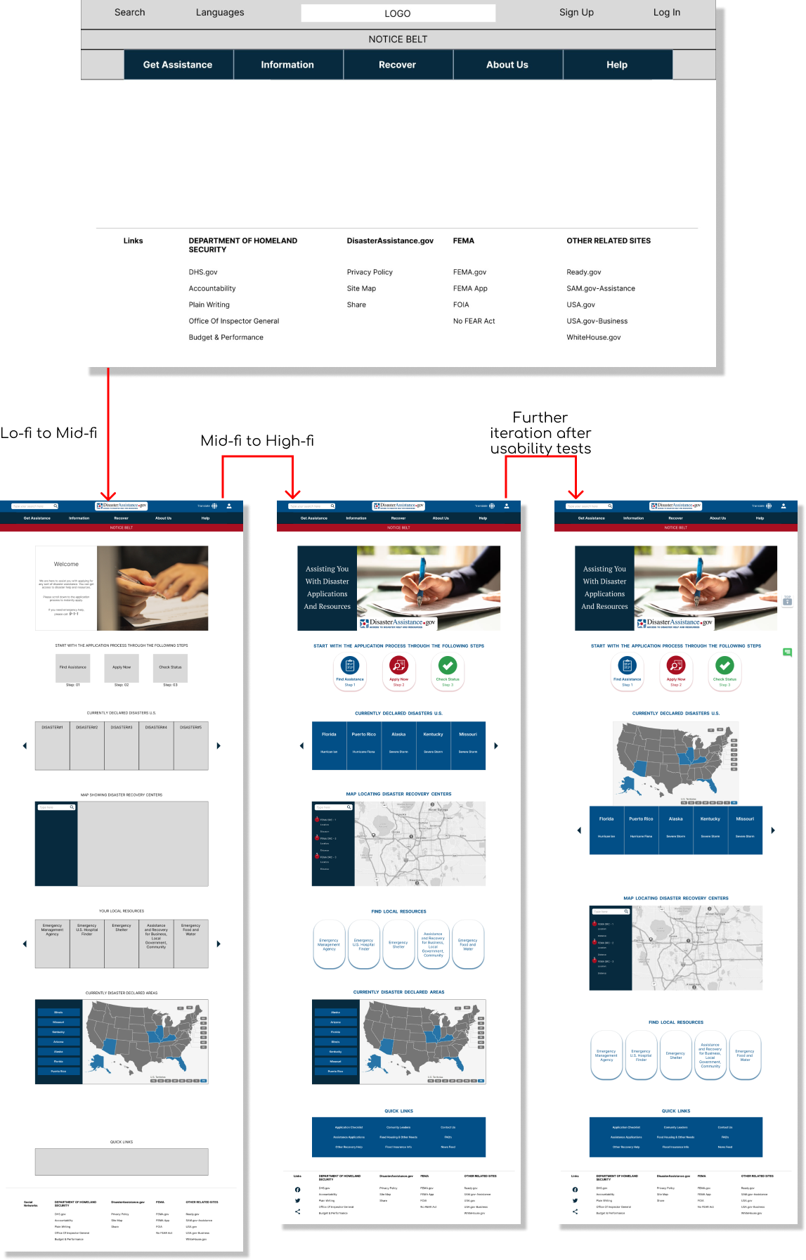
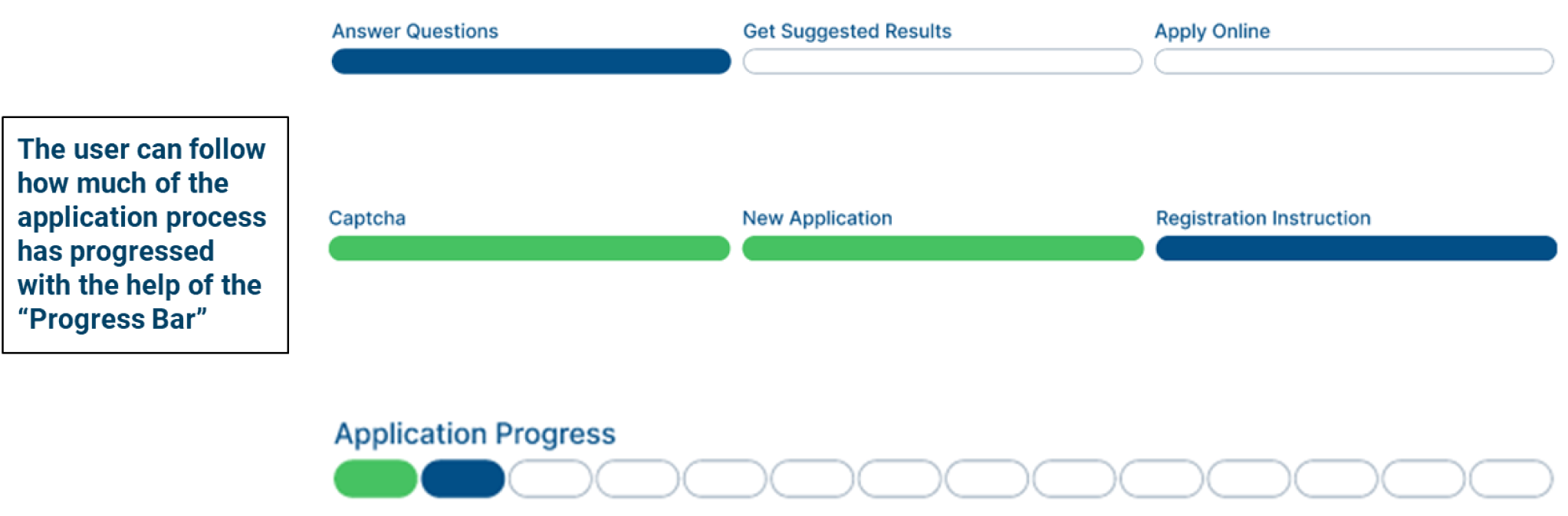
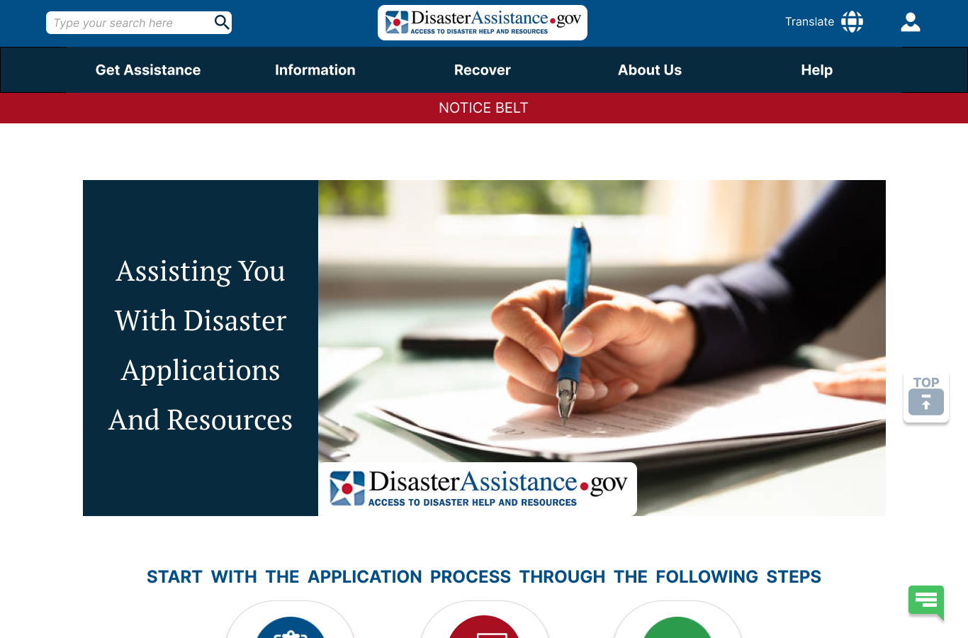
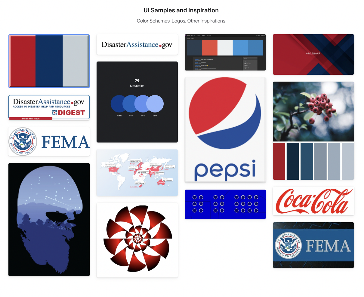
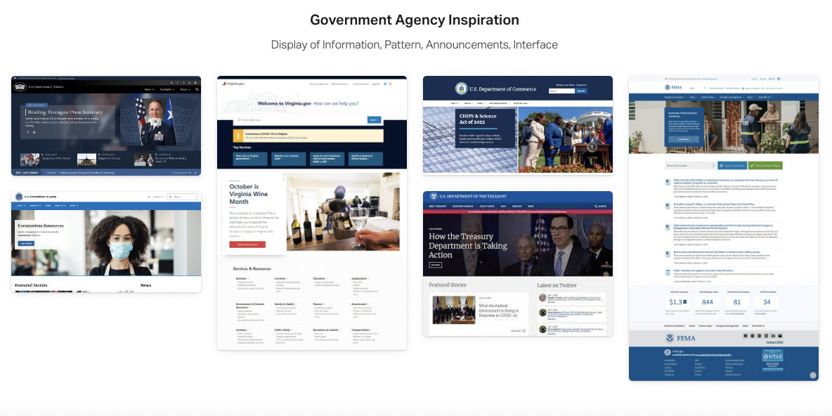
Disaster Assistance helps users to obtain information and fill out forms when met with a disaster. The users need to be able to find all the necessary information and apply for assistance easily so that they can get help as soon as possible. They need to understand what kind of applications they are eligible to apply to and if they are in a disaster declared state. We want the users to be able to track the progress of their applications.
Solution
Redesign a federal website making it also a responsive web design that can help users locate necessary information and assistance ensuring seamless application processing and getting the required assistance when users have met with a natural disaster.
Tools
Figma, FigJam, Adobe Photoshop/Illustrator, Google Drive/Docs/Slides/Sheets, InVision, Zoom, Slack, Trello, Screen To GIF
Duration
4 Weeks
Solo Project
Fayeka Fateh
.png)
.png)
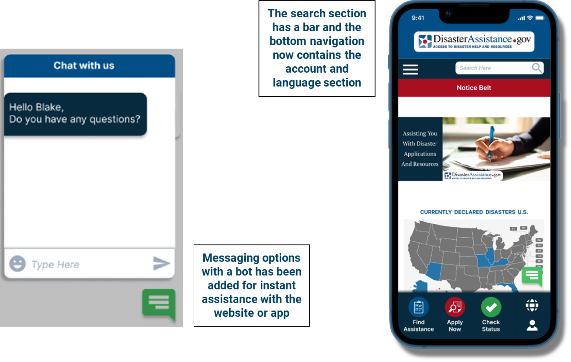
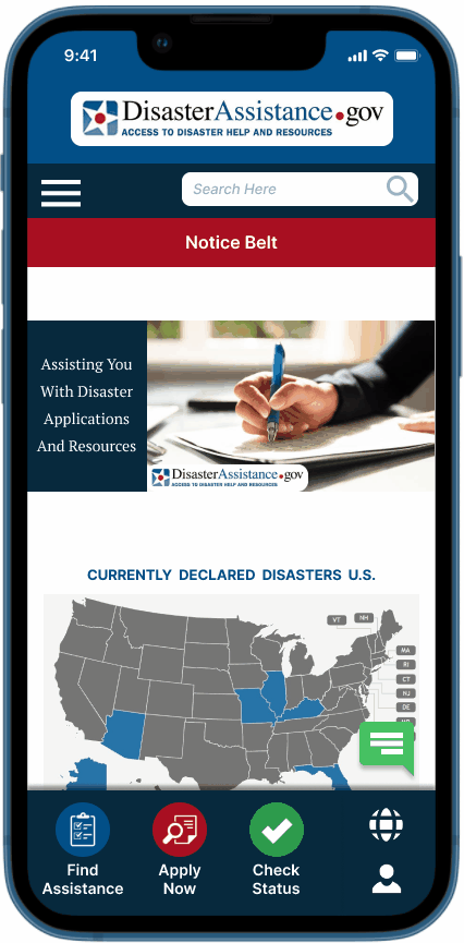
 Homepage Annotations-Section1.png)
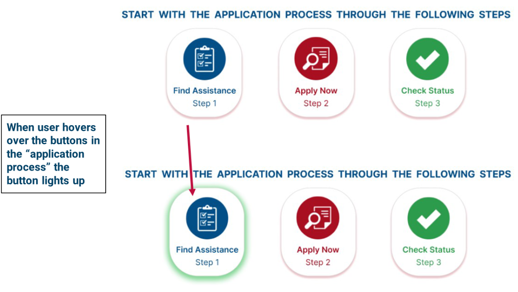
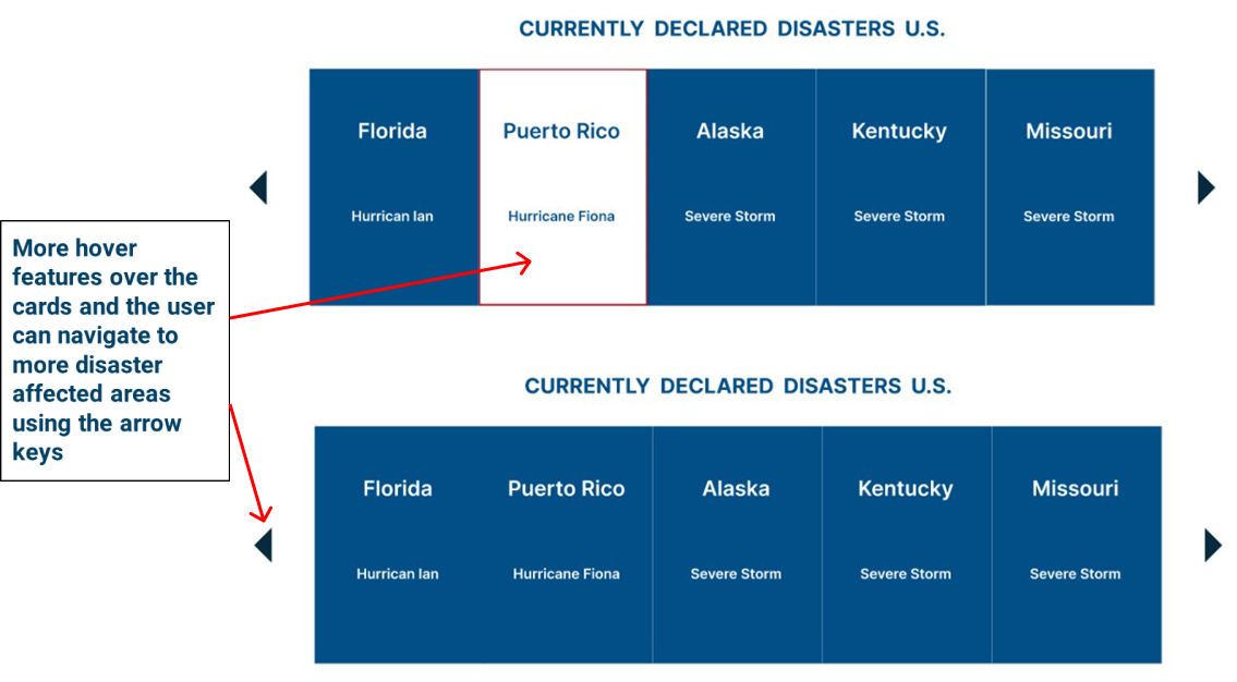
 Homepage Annotations.png)
.png)
.png)
.png)
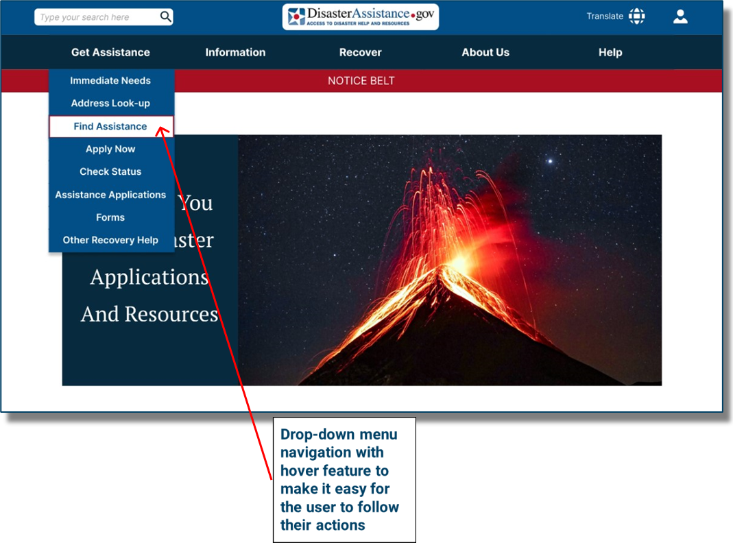
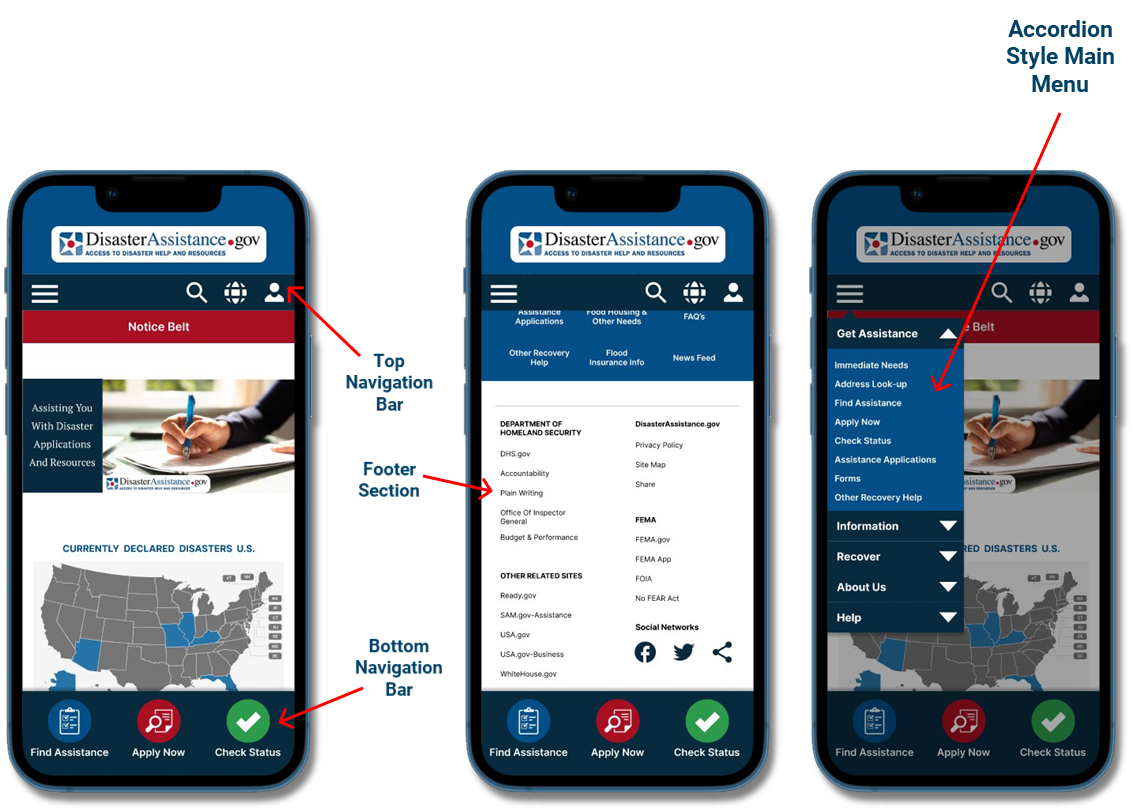
 Disaster Assistance Primary Navigation Annotation Fayeka.png)
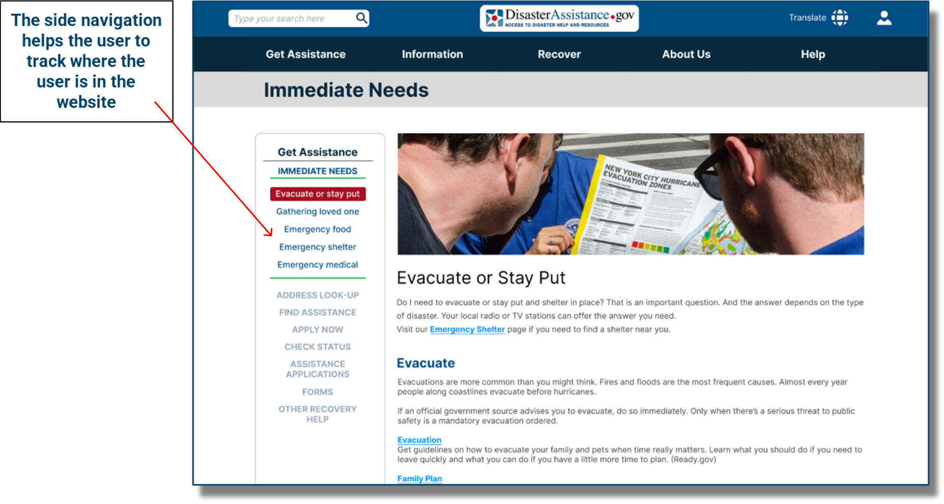
 Disaster Assistance Secondary Navigation Side bar Annotation Fayeka.png)
 Disaster Assistance Footer Navigation Annotation Fayeka.png)
.png)
.png)
.png)